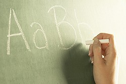
Lettering is a real bugaboo for some new—and not-so-new—digitizers. I have always believed the reason some shy away from lettering but dive right into designs is because lettering is (or should be) recognized by everyone, sort of like so-called “memory” colors in screen printing. An E is supposed to look like . . . an E, and customers will notice any variation. Thus does it become so much more important to be precise and perfect in our digitizing execution.
As a result, we are always seeking short-cuts. One of most interesting developments in short-cut digitizing is the development of the TrueType font conversion capability. Just choose a font on your computer and press a button. We can match any font on any logo or letterhead. Now our “need for speed” is satisfied and, if we know the name of the font on the business card with which we are presented, we’re three steps ahead.
But some conversions end up taking us four steps backwards because the process is less than perfect, and we have to edit then edit some more.
For this reason, I prefer to digitize my lettering by hand, from scratch—one stitch at a time. But I have played with the TrueType conversion program enough to know that some of the fonts work better than others. And I began to wonder if there was a good reason for that.
Corporate drama
The story of the development of TrueType (scalable) fonts is fraught with intrigue, drama that can hold its own against the best paperback thrillers in the bookstore. Picture the headlines:
Major players try to hold their own against upstarts and competitors!
Decisions made that will IMPACT THE display of fonts on computer monitors for years to come!
The time is the mid-1980s. . . .
It’s cloak-and-dagger time: Adobe (the upstart) is trying to gain a market share in the font world, striking fear in the hearts of Microsoft and Apple (the big guys). That fear—of losing market share and (gasp!) royalties—as well as a loathing to let Adobe in on key operating-system secrets, sends the two icons into each other’s arms. They scurry for the drawing board, eager to develop a program that will put Adobe’s young Postscript in the shade.
All of this makes for great reading, and it also made me realize that the same sort of stuff that goes on in the embroidery industry is happening elsewhere. But I don’t know whether to be buoyed up or let down by that realization.
For those of you who digitize, a lot of the inside information about how TrueType fonts perform will sound very familiar. I love discovering parallels between the world I know and the one I don’t know yet. It makes things . . . well, connect, and the resulting feeling of wholeness and completion makes it easier to understand my own little piece of the universe.
A bit of history
Back to the saga of scalable lettering—a familiar concept to those who want to enlarge or decrease digitized embroidery designs and lettering.
Adobe had developed a font system called Postscript for use with printers. In the hopes of landing a spot on the podium as the guru of font technology for personal computers, it offered a “display” version of postscript to Apple and Microsoft.
It was turned down.
Adobe was disappointed and countered (in 1989) by offering TypeManager to the public and publishing the secrets of the control points of its Type 1 fonts. (No longer did font creators have to pay royalties to create a font editor.)
Apple didn’t bat an eye, and continued work on a TrueType font program it was developing. In September of the same year, it announced its work-in-progress—a TrueType, scalable font program which, combined with its ally Microsoft’s printing engine, would take on Adobe’s TypeManager.
In 1991 the first TrueType fonts were introduced by Apple. A year later, Microsoft’s Windows 3.1 was released using TrueType fonts. You receive many TrueType fonts when you purchase your computer; others can be acquired from many different companies and installed on your computer—at which point they become available for use in any document or drawing program.
It seems incredible to realize that scalable fonts for display on computers, where the bitmaps of the letters generated looked as though each were fashioned carefully “by hand” are as young as that—still in their teens. Sometimes it seems as though computers have been around forever.
Creating letters for embroidery
This idea of fashioning fonts by hand should be familiar to those who do embroidery. In our world, we can prepare lettering in several different ways:
1)We can digitize lettering a stitch at a time (“by hand”).
2)We can use pre-digitized lettering. Lettering that comes with the digitizing program we purchase can be as simple to use as typing out words in a report. Each design (letter) is associated to the corresponding letter on the computer keyboard. Each series of designs (alphabet) is proprietary; it is digitized in the native language (a unique file extension) of our particular program and is included with the program or sold individually. We can also purchase lettering that is not prepared by our particular digitizing system. It is generally sold to you in a .dst format, a stitch/machine format that allows more limited editing than a native format—usually up to 15 or 20 percent. Words are built a-letter-at-a-time, in the same way that we merge two or more digitized designs together. (Many softwares now claim to be able to convert this .dst format into the totally editable native format. You be the judge of how well it works in a demonstration, before you buy.)
3)We can use a TrueType font module that is included in many digitizing systems today or can be purchased as a stand-alone program. This program converts any Windows TrueType font into stitchable letters.
What’s behind scalable fonts?
The technology behind TrueType fonts is two-fold. The first part is a mathematical description of the character constructed from a series of points also known as an outline font format. Each outline can be scaled to many different sizes, enabling perfect letters no matter what the resolution and precise shapes no matter what size it is printed. This math also dictates how the characters should be spaced both vertically and horizontally.
The second part is a program called a rasterizer which reads the outline description and creates the bitmap. The rasterizer is a bit of magic. It not only reads the outline, but also scales it to the size requested, adjusts the outline using the hinting instructions (described below) and fills in the resulting outline with pixels so it stays smooth and perfect.
Before the advent of the scalable fonts, changing the size of the glyphs (the symbols that form a single character in a font) resulted in a loss of proportion, detail, widths and precision. The TrueType solution brought with it perfect curves, fine details, accurate proportions and consistent widths. This was accomplished by a background process called hinting or instructing a font.
Hinting is a method of determining which pixels are activated in order to create the best possible character shape at small sizes and low resolutions. The glyph's outline determines which pixels comprise the bitmap of a letter at a given size.
Sometimes the outline must be edited in order to create a good image. (Sound familiar?) When a hint is added to the font, a mathematical instruction then exists that distorts the character's outline at particular sizes. (Sort of like pull compensation; it sounds as if, were you to add a stitch engine to this whole process, you would have—ta-da!—a digitizing software.)
In TrueType a combination of these hints, and the resulting distortions, affords a very fine degree of control over the bitmap shape produced. This is a variation of WYSIWYG (what-you-see-is-what-you-get). What happens behind the scenes is distorted so the letter appears perfect on screen—the opposite of digitized designs where what you see on the screen is imperfect but the stitch-out is (hopefully!) spot on.
The good, the bad and the ugly
A font that is finely hinted has a hand-fashioned quality and the speed of the best outline formats. Because the resulting bitmaps are produced by this outline font, text can be rotated, scaled and sized without loss of quality.The TrueType font format has much more powerful and flexible hinting capabilities than other font formats and so are the best fonts to choose for displaying text on the screen.
But when TrueType development began, it was working under the 16-bit handicap and many of the professional font developers didn’t bother to enter the market. As is often the case, poorly executed fonts were plentiful. Less than perfect outlines combined with almost non-existent hinting gave TrueType a bad name.
Windows 95 brought TrueType into the 32-bit world. Combined with grayscale rasterization (anti-aliasing), the fonts were more perfect on the screen and behaved more reliably than ever.
How this relates to embroidery
TrueType font converters in embroidery software have been around for a while. The one I have works very simply. I open the lettering section of the program (a unit in a larger software, although it is offered as a stand-alone program) and choose TrueType from a fly-out. A drop-down menu allows me to choose from any font on my computer. Many of them have the TT logo that identifies them as Microsoft TrueType fonts, and others are aftermarket fonts.
It might be coincidence, but it seems that when I choose some of the aftermarket fonts, they need a whole lot more editing than others. Manipulating stitching directions, removing short stitches on corner and curves; the plot thickens as you travel through the letters, adjusting and refining. When I choose a Microsoft font I have the least trouble of all.
It would seem that we would have the best chance of an easy, precise conversion if we start with the best art—something we are urged to do from the moment we take up the art of digitizing. Thus, fonts that come with the best hinting would be a first choice.
There are many digitizers who blame the TrueType converter and its developers if the conversion into stitches isn’t perfect. This is just as faulty a conclusion as blaming a digitizer for a design that doesn’t stitch out perfectly. In this case, it could be that your machine isn’t timed, tensioned and threaded correctly. Or maybe your fabric isn’t hooped taut enough. Or maybe everything is okay, but just isn’t the same as your digitizer’s machine. If your machine and preparation techniques don’t match those of your digitizer, there are bound to be some differences.
The same conclusion might be drawn if you start with less than perfect fonts. How will you know if a font has proper hinting and is precise in its outline? How will you know if the font is a fine aftermarket design or one not so carefully wrought? The proof of the pudding will be in the tasting—but isn’t it nice to know that there may be some place to put the blame other than on the developer of the program?
It will take some more research before I am sure that the quality of the font itself shares any blame for poor stitching in font-conversion programs. Understanding how the TrueType fonts work behind the scenes is a good place to start.
And it makes sense. We may not be able to do anything about it. I mean, what are we going to do? Demand fonts that are more in tune with stitch conversion? But understanding always helps me deal with the glitches in life. It engenders patience.
We should look beyond the obvious when we are working with tools made by man—and man himself. We should be quick to understand and slow to blame. Life works out better that way. My hugs are reserved for the embroiderers this month—the ones who make this industry hum.